
Today, I want to delve into the captivating world of violet and blue. These two colors may seem similar at first glance, but they possess unique characteristics that set them apart. In this article, I’ll be unraveling the differences between violet and blue, shedding light on their individual qualities and exploring the impact they have on our emotions and perceptions. So, if you’ve ever wondered about the subtle distinctions between these captivating hues, you’re in the right place. Let’s dive in and discover the intriguing world of violet versus blue.
The Color Spectrum
Understanding Colors: Violet and Blue
When it comes to colors, one cannot ignore the mesmerizing world of violet and blue. These two hues may appear similar at first glance, but they have distinct characteristics that set them apart.
Violet, also known as purple, sits at the end of the visible light spectrum. It has a shorter wavelength and higher frequency compared to other colors. Its energetic nature gives it a vibrant and intense appearance. Violet has long been associated with creativity, spirituality, and luxury. It’s often used in art, fashion, and branding to evoke a sense of mystery and magic.
On the other hand, blue is a color that is often associated with calmness and tranquility. It is located towards the middle of the visible light spectrum, with a slightly longer wavelength and lower frequency than violet. Blue is often regarded as a symbol of peace, trust, and stability. It’s commonly used in interior design, healthcare, and communication to create a soothing and relaxing environment.
The Visible Light Spectrum
To understand the differences between violet and blue, it’s important to have a basic understanding of the visible light spectrum. The visible light spectrum is the portion of electromagnetic radiation that human eyes can perceive. It consists of a range of colors, with each color corresponding to a specific wavelength and frequency.
Here’s a breakdown of the colors in the visible light spectrum:
| Color | Wavelength (nm) | Frequency (THz) |
|---|---|---|
| Red | 620-750 | 400-484 |
| Orange | 590-620 | 484-508 |
| Yellow | 570-590 | 508-526 |
| Green | 495-570 | 526-606 |
| Blue | 450-495 | 606-668 |
| Violet | 380-450 | 668-789 |
As you can see from the table above, blue has a slightly shorter wavelength and higher frequency compared to violet. This distinction in their position within the visible light spectrum contributes to their unique visual characteristics and emotional impact.
Without a conclusion paragraph, let’s dive deeper into the fascinating world of violet versus blue and explore their impact on our emotions and perceptions.
Hex and RGB Code Violet and Blue
| Color | RGB Code | Hex Code | Description |
|---|---|---|---|
| Violet | RGB(238, 130, 238) | #EE82EE | Violet is a light and vivid shade between blue and purple, symbolizing creativity, luxury, and mystery. |
| Blue | RGB(0, 0, 255) | #0000FF | Blue is a primary color associated with calm, stability, and depth. It is often linked with the sky and ocean, evoking tranquility. |
Violet leans towards the purple spectrum, while Blue is a pure color often associated with peaceful and natural elements.
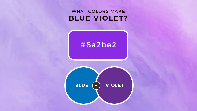
What Happens When You Mix Colors
When Blue and Violet are mixed, they create a Blue-Violet (also called Indigo) color. The resulting shade leans more towards blue with a hint of purple, depending on the ratio of the two colors.
- If you add more blue, the result will be a deeper bluish-violet.
- If you add more violet, the result will have a stronger purple tone.
In essence, Blue-Violet is a tertiary color that blends the cool, calm qualities of blue with the richness and mystery of violet.
Characteristics of Violet and Blue
Vibrancy and Intensity
When it comes to vibrancy and intensity, violet and blue have their own unique characteristics.
- Violet, also known as purple, is an intense color with a rich and vibrant appearance. It has a deep and luxurious feel that often evokes a sense of creativity, spirituality, and mystery. (source: Color Psychology)
- On the other hand, blue is a calming and tranquil color. It carries a sense of tranquility and serenity, offering a feeling of relaxation and peace. Blue is often associated with stability and trust. (source: Color Psychology)
Psychological Effects
Both violet and blue have psychological effects on our emotions and perceptions.
- Violet stimulates the imagination and encourages creativity. It can also have a calming effect on the mind, allowing for introspection and deep thought. (source: Psychology of Color)
- Blue, on the other hand, has a soothing and calming effect. It promotes a sense of peace, reduces stress, and can even lower blood pressure. This color is often used in spaces where relaxation is desired, such as bedrooms or spa environments. (source: Psychology of Color)
Symbolism and Cultural Significance
Violet and blue carry symbolic meanings and cultural significance across various societies and traditions.
- Violet is often associated with luxury, power, and royalty. In ancient times, violet dye was expensive to produce, making it a color reserved for monarchs and nobility. It continues to symbolize wealth and extravagance in many cultures. (source: Color Symbolism)
- Blue is commonly associated with trust, loyalty, and stability. It represents reliability and dependability, often used in corporate branding and uniforms. In religious iconography, blue is connected to divinity and heaven. (source: Color Symbolism)
Both colors have fascinating characteristics, psychological effects, and cultural symbolism. Exploring their nuances can shed light on how they shape our emotions and perceptions.
Comparing Violet and Blue
Similarities
When comparing violet and blue, it is important to note that they are both part of the cool color family. This means they are on the cooler end of the color spectrum and often evoke a sense of calmness and tranquility. Both colors can also have a soothing effect on the mind and body, making them popular choices for creating relaxing environments.
Another similarity between violet and blue is their association with nature. They can both be found in various aspects of the natural world, such as the sky, flowers, and bodies of water. This connection to nature adds to their appeal and reinforces their calming qualities.
Differences in Hue
One of the main differences between violet and blue lies in their hues. Violet, also known as purple, is often described as a combination of red and blue. It tends to have a reddish undertone and is considered to be a more intense color. On the other hand, blue is a primary color and does not contain any undertones. It is a more pure and vibrant shade than violet.
Differences in Wavelength
In terms of wavelength, violet and blue also have distinct differences. Violet has a shorter wavelength compared to blue. It falls at the end of the visible light spectrum, just before ultraviolet light. This shorter wavelength gives violet a higher frequency and energy level. Blue, on the other hand, has a longer wavelength and lower frequency than violet.
Differences in Perception
The way we perceive violet and blue can also vary. Violet is often associated with creativity and imagination. Its intense and vibrant nature stimulates the mind and encourages out-of-the-box thinking. On the other hand, blue is often linked to feelings of serenity and calmness. It has a soothing effect on the senses and promotes a sense of relaxation and peace.
The differences in perception extend to their symbolic meanings as well. Violet is often associated with luxury, power, and creativity. It has a regal and majestic quality that is often linked to wealth and royalty. Blue, on the other hand, is commonly associated with trust, loyalty, and stability. It is a color that inspires confidence and reliability.
As you can see, there are both similarities and differences between violet and blue. While they both belong to the cool color family and can create a sense of calmness, they differ in hue, wavelength, and perception. Understanding these variations can help us better appreciate the unique characteristics and effects of each color.
Practical Applications of Violet and Blue
Art and Design
In the realm of art and design, both violet and blue find their practical applications. As an artist, I often use these colors to evoke specific moods and emotions in my works.
- Violet, with its intense and luxurious nature, is frequently utilized to depict richness and power. It adds a touch of grandeur to paintings, sculptures, and other artistic creations.
- On the other hand, blue, with its calming and serene essence, is often employed to create a sense of tranquility and stability. It can be found in various art forms, from serene landscapes to abstract pieces meant to induce relaxation.
By understanding the unique characteristics and symbolism of violet and blue, artists and designers can effectively harness these colors to convey their intended messages and evoke specific emotional responses.
Marketing and Branding
In the world of marketing and branding, color plays a crucial role in influencing consumer behavior and perception. Both violet and blue have their place in this realm as well.
- Violet, being associated with luxury and creativity, is often used by high-end brands to represent sophistication and exclusivity. It appeals to consumers seeking a sense of elegance and uniqueness.
- Blue, with its traits of trust and stability, is commonly employed by companies looking to establish themselves as reliable and dependable. It instills a sense of confidence and portrays a professional image.
Understanding the psychological effects of violet and blue allows marketers and brand strategists to make informed decisions in choosing these colors to create visual identities that resonate with their target audience.
Color Therapy
In the field of color therapy, both violet and blue are utilized to promote healing and balance.
- Violet is believed to stimulate creativity and imagination, making it beneficial for individuals seeking inspiration or looking to tap into their artistic side. It is also associated with spiritual growth and intuition.
- Blue, known for its calming properties, is often used to alleviate stress, anxiety, and promote a sense of tranquility. It is believed to have a soothing effect on the mind and body, making it ideal for relaxation and meditation.
By incorporating violet and blue in color therapy practices, practitioners aim to harness the unique qualities of these colors to achieve physical, emotional, and mental well-being.
The practical applications of violet and blue extend beyond art and design. They play a significant role in marketing and branding, as well as color therapy. Understanding the symbolism and effects of these colors allows us to harness their power in various fields.
Conclusion
Understanding the differences between violet and blue is essential for appreciating their unique characteristics and effects. Both colors belong to the cool color family and evoke a sense of calmness and tranquility. Violet, with its reddish undertone, is more intense and symbolizes luxury, power, and creativity. On the other hand, blue, as a primary color, is pure and vibrant, representing trust, loyalty, and stability.
Violet stimulates creativity and imagination with its shorter wavelength and higher frequency. It is often used in art and design to depict richness and power. Blue, with its longer wavelength and lower frequency, promotes serenity and calmness, making it a popular choice for creating a sense of tranquility and stability in artwork and design.
In marketing and branding, violet is associated with luxury and creativity, while blue represents trust and stability. This understanding allows businesses to strategically use these colors to convey specific messages and evoke desired emotions in their target audience.
Furthermore, both violet and blue have therapeutic benefits. Violet stimulates creativity and imagination, while blue alleviates stress and promotes relaxation in color therapy.
By harnessing the power of violet and blue, we can create visually appealing designs, convey powerful messages, and promote emotional well-being in various fields.