When it comes to colors, there’s always a fascinating debate to be had. Today, I want to dive into the world of chartreuse green and yellow. These two hues are often mistaken for each other, but they each have their own unique qualities that set them apart. Join me as we explore the vibrant world of chartreuse green and yellow and discover what makes them so captivating.
Chartreuse green is a color that demands attention. Its vibrant and intense shade is reminiscent of fresh spring leaves and lush grass. With its energetic and lively nature, chartreuse green is often associated with growth, renewal, and vitality. On the other hand, yellow is a color that exudes warmth and cheerfulness. It radiates positivity and optimism, bringing a sunny and bright vibe to any space. Both chartreuse green and yellow have their own distinct personalities, and understanding their nuances can help us appreciate their beauty even more.
So, let’s embark on this color journey together and unravel the enchanting differences between chartreuse green and yellow. From their origins to their psychological impact, we’ll explore it all. Get ready to dive into the world of colors and discover the magic that lies within chartreuse green and yellow.
What is Chartreuse Green?
Characteristics of Chartreuse Green
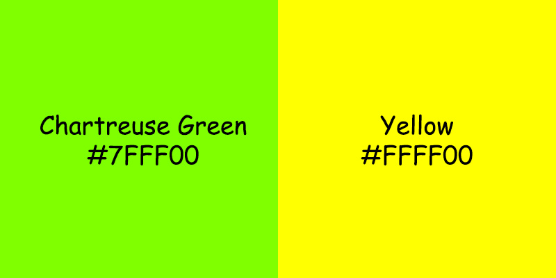
Chartreuse green is a vibrant and intense color that falls between yellow and green on the color spectrum. It is named after the liqueur produced by the Carthusian monks in the 18th century. This bold color is known for its unique qualities and characteristics:
- Vibrancy: Chartreuse green is highly saturated, making it a visually striking color that grabs attention.
- Intensity: The color exudes energy and liveliness, making it an excellent choice for creating a focal point or adding a pop of color in design.
- Versatility: While chartreuse green is often associated with nature and springtime, it can also convey a sense of luxury and opulence.
Uses of Chartreuse Green
Chartreuse green has a wide range of applications across various fields. Here are some common uses of this vibrant color:
- Fashion: Chartreuse green is popular in the fashion industry, often seen on runways and red carpets. It adds a bold and eye-catching element to clothing and accessories.
- Interior Design: This color can be used as an accent or statement color in interior design to add flair and personality to a space. It pairs well with neutrals and earthy tones.
- Digital Design: Chartreuse green is commonly used in digital interfaces to highlight important elements or call-to-action buttons. Its vibrancy draws user attention and prompts interaction.
- Branding: Many brands incorporate chartreuse green into their logos and branding materials to convey energy, vitality, and a modern aesthetic.
Chartreuse Green in Design
In the world of design, chartreuse green plays an essential role, offering a variety of uses and possibilities. Here are a few ways it is utilized:
- Contrast: Chartreuse green works well as a contrasting color in design due to its intensity. It can be paired with darker colors like navy or black to create a striking and visually appealing contrast.
- Highlighting: This vibrant color is often used to highlight important information or elements in design, such as headings or key details. It immediately draws the viewer’s attention to the highlighted area.
- Emotional Impact: Chartreuse green can evoke emotions such as excitement, energy, and positivity. It is often associated with growth, renewal, and vitality, making it suitable for designs related to wellness, sustainability, or nature-inspired themes.
Chartreuse green is a versatile color that adds vibrancy and energy to various fields, from fashion to digital design. Its unique characteristics and visual impact make it a popular choice for those looking to create a striking and memorable visual experience.
What is Yellow Color?
Yellow color is a vibrant and cheerful hue that falls between green and orange on the color spectrum. It is often associated with feelings of happiness, positivity, and energy. In this section, I’ll explore the characteristics of yellow, its various uses, and its role in design.
Characteristics of Yellow Color
- Vibrancy: Yellow is known for its bright and eye-catching appearance. It has a high saturation level, making it stand out in any context.
- Warmth: Yellow is a warm color, evoking feelings of sunshine and warmth. It can create a welcoming and cozy atmosphere.
- Attention-Grabbing: Yellow is highly noticeable and grabs attention quickly. It can be used to draw focus and highlight important elements.
- Versatility: Yellow can range from pale, pastel shades to bold and intense tones. This versatility allows for a wide range of applications in different settings.
- Symbolism: In many cultures, yellow symbolizes joy, happiness, and enlightenment. It is also associated with wealth and prosperity in some traditions.
Uses of Yellow Color
Yellow color is utilized in various fields and industries due to its unique characteristics. Here are some common uses of yellow:
- Fashion: Yellow is often used in clothing and accessories to create bright and trendy looks. It adds a pop of color and can make a bold fashion statement.
- Interior Design: Yellow can be incorporated into interior spaces to create a lively and energetic atmosphere. It can be used as an accent color or as the main color in a room to brighten up the space.
- Advertising and Branding: Many brands use yellow in their logos and marketing materials to catch people’s attention and create a positive association with their products or services.
- Signage and Safety: Yellow is widely used in signage and safety equipment due to its high visibility. Yellow signs or markings alert people to potential hazards and draw attention to important instructions.
- Art and Creativity: Artists often use yellow to represent light, warmth, and happiness in their artwork. It can be used to create a focal point or evoke specific emotions in a composition.
Yellow Color in Design
In design, yellow color can play a significant role in creating visually appealing and impactful designs. Here are some ways yellow can be used in design:
- Contrast: Yellow can be paired with contrasting colors to create dynamic and eye-catching compositions. Its vibrancy and brightness make it an effective choice for creating visual interest.
- Highlighting: Yellow can be used to emphasize important elements in a design. Whether it’s highlighting key information or drawing attention to a specific area, yellow can make elements stand out.
- Emotion: Yellow can evoke various emotions depending on the tone and context. It can create feelings of happiness, optimism, and energy. Designers can utilize yellow to convey specific moods or messages in their creations.
Yellow and chartreuse green are closely related colors, with chartreuse being a more intense and yellow-green shade. While they share some similarities, they hold distinct characteristics, each with its own unique charm and impact. Understanding the characteristics and uses of each color allows designers and individuals to incorporate them effectively in their projects, leveraging the emotions and visual impact that these colors bring.
Comparing Chartreuse Green and Yellow Color
Similarities between Chartreuse Green and Yellow Color
When comparing chartreuse green and yellow color, it’s important to note that they do share some similarities. Let me highlight a few key ones:
- Vibrancy: Both chartreuse green and yellow are vibrant colors that catch the eye. They have the power to grab attention and make a statement in any design.
- Warmth: Both colors exude warmth, creating a welcoming and inviting atmosphere. This makes them popular choices for interior design and decor.
- Versatility: Chartreuse green and yellow can be used in a variety of design applications, ranging from fashion and advertising to art and signage. Their versatility allows for endless creative possibilities.
- Symbolism: Yellow is often associated with joy, happiness, and positivity. Similarly, chartreuse green is often seen as a symbol of growth, renewal, and vitality. Both colors can evoke strong emotions and convey specific messages.
While chartreuse green and yellow do share these similarities, it’s important to explore their unique differences as well.
Differences between Chartreuse Green and Yellow Color
While chartreuse green and yellow color share some similarities, they also have distinct characteristics that set them apart. Here are a few key differences:
- Color Spectrum: Chartreuse green lies on the green-orange spectrum, whereas yellow falls between green and orange. This slight variation in their position on the color spectrum gives them a different visual impact.
- Tone and Shade: Chartreuse green tends to have a slightly cooler undertone, leaning more towards green, while yellow has a warmer undertone, leaning more towards orange. This difference in tone and shade affects the mood and atmosphere they create.
- Historical Context: Chartreuse green has a rich history, with its name stemming from the liqueur produced by the Carthusian monks in France. On the other hand, yellow has been used symbolically throughout different cultures, representing diverse meanings such as wealth, enlightenment, and spirituality.
- Cultural Associations: Both chartreuse green and yellow color have specific cultural associations. Chartreuse green is often connected to nature, growth, and freshness, while yellow is associated with sunlight, positivity, and happiness. These cultural connotations can influence how the colors are used and interpreted in different contexts.
By understanding these differences, designers and creatives can make informed choices about which color to use to achieve their desired visual impact and emotional response.
While chartreuse green and yellow color share vibrant and warm qualities, they also have distinct characteristics that make them unique. Understanding the similarities and differences between these colors allows for a more nuanced and informed approach when incorporating them into design projects. Let’s explore some practical applications of these colors next.
Conclusion
Chartreuse green and yellow color are both vibrant and versatile choices for designers. While they share similarities in terms of warmth and symbolism, they also have distinct differences that should be considered. Chartreuse green falls on the greener side of the color spectrum, while yellow leans towards the warmer side. Additionally, chartreuse green has a cooler tone and tends to be more subdued, while yellow is brighter and bolder.
The historical context and cultural associations of these colors also play a role in their usage. Chartreuse green has ties to the liqueur and the religious order, while yellow is often associated with happiness and positivity.
Both colors have practical applications in design projects, and understanding their unique characteristics allows designers to make informed choices based on their desired visual impact and emotional response. Whether it’s chartreuse green or yellow, these colors can add vibrancy and depth to any design.
Frequently Asked Questions
Q: What are the similarities between chartreuse green and yellow?
A: Both chartreuse green and yellow colors are vibrant, warm, versatile, and symbolize nature and energy.
Q: What are the differences between chartreuse green and yellow?
A: Chartreuse green is positioned between yellow and green on the color spectrum, while yellow is a primary color. Chartreuse green has a yellowish-green tone, and yellow is a pure shade of its own. Also, chartreuse green has historical and cultural significance related to the liqueur it’s named after.
Q: How can designers use these colors in their projects?
A: Designers can use chartreuse green and yellow colors to create visual impact and evoke emotional responses. Chartreuse green brings a modern and sophisticated feel, while yellow adds energy, positivity, and warmth. Both colors have practical applications in design projects.
Q: What is the significance of these colors in design?
A: Chartreuse green and yellow have cultural associations with nature, energy, positivity, and warmth. They can be used to convey different emotions and messages based on the context and the desired visual impact.
Q: How can understanding the differences between these colors benefit designers?
A: Understanding the differences between chartreuse green and yellow allows designers to make informed choices about which color to use in their design projects. They can consider factors like symbolism, historical context, cultural associations, and the desired emotional response to guide their color selection.
Leave a Reply