
Ecru, cream, and white are light neutrals, but they create different effects when placed side by side. Ecru usually has a muted beige or tan cast. Cream usually has a clearer yellow cast. White generally appears brighter, although a white fabric or paint can still lean warm, cool, or neutral.
These names describe families of colors rather than exact shades. A cream wall paint may be lighter than an ecru curtain, while another manufacturer’s “cream” may look distinctly yellow. The broader term off-white covers many near-white colors, including some ecrus and creams. To choose among them for clothing, interiors, textiles, or digital design, look beyond the label: compare undertone, lightness, material, and lighting.
What Color Is Ecru?
Definition and Visual Characteristics of Ecru
Ecru is a pale, muted neutral traditionally associated with the color of unbleached linen. It often looks like white softened with a little beige, tan, gray, or yellow-brown. Some versions sit very close to off-white; others look closer to light beige. That range is why two products labeled “ecru” may not match.
Compared with a crisp white, ecru usually has lower apparent lightness and more visible color. Its coloration is still restrained, so it rarely looks strongly saturated. An ecru sofa, for example, can read as a light neutral across a room, then reveal its beige undertone beside a white sheet of paper. The exact impression depends on the fabric or finish, nearby colors, and the light falling on it. Treat “ecru” as a useful visual description, not a precise color specification.
Why Ecru Is Associated With Natural Fabrics
The connection between ecru and textiles comes from the word’s association with raw or unbleached material, particularly linen. Fibers that have not been whitened to a bright finish can retain a subdued natural color. The result may look creamy, grayish, yellowish, or tan rather than uniformly white.
“Natural” does not guarantee that every piece of linen or cotton will have the same shade. Fiber source, processing, fabric construction, and finishing all affect appearance. A tightly woven cloth can also reflect light differently from a textured one, even when their measured colors are close. Bleached white fabric is deliberately processed to remove or reduce natural coloration; some bright white textiles receive additional whitening treatments. Ecru remains a useful name for the quieter, unbleached-looking end of that comparison, even when a finished product has been colored to achieve the look.
Is Ecru Beige or Off-White?
Ecru can reasonably be described as either a beige-leaning off-white or a very light beige. The deciding factor is the particular sample. If it looks almost white until placed next to a crisp white reference, “off-white” is a helpful description. If its tan or brownish quality is immediately visible on its own, “light beige” may communicate it better.
Color names do not have strict boundaries in ordinary retail use. A paint company’s ecru might be pale and grayish, while a clothing brand’s ecru might be warmer and deeper. This matters when buying items from different suppliers: matching names cannot establish a match between a rug, curtains, and upholstery. Compare physical samples in the intended setting whenever possible. For online purchases, product photographs can help narrow choices, but screen settings and photography can conceal the difference between an off-white ecru and a beige one.
What Color Is Cream?
Definition and Visual Characteristics of Cream
Cream is a warm off-white whose most recognizable feature is a yellow undertone. Imagine a white base with a small amount of soft yellow added: depending on how much color is present, the result can be barely tinted or noticeably buttery. Cream typically feels warmer than a neutral white, although the exact shade may also contain touches of beige or peach.
Its lightness and chroma vary. A pale cream can appear nearly white under some lighting, while a deeper cream has more obvious color and less contrast against beige or tan. Compared with ecru, cream usually shows a clearer yellow influence rather than a muted, natural-fiber beige. That distinction is practical when coordinating finishes. A yellow cream cabinet door may look especially yellow against a grayish ecru wall, even though both looked like compatible neutrals when viewed separately.
Is Cream Considered White?
In everyday design language, cream belongs to the off-white family. It can function much like white as a light background, especially when its yellow tint is subtle. It is still useful to distinguish cream from a neutral white because putting them together can expose the difference: the cream may suddenly look warmer and the white may look cooler or sharper.
“Warm white” and “cream” can overlap. Usually, warm white still reads predominantly as white, with only a slight warm undertone, while cream has enough yellow to register as a separate shade. There is no universal dividing line. A very pale cream wall might look white in isolation or in warm evening light, then look unmistakably creamy beside white trim in daylight. If the relationship matters, compare the exact paint or fabric samples together rather than relying on the names.
Cream vs Ivory
Ivory and cream are closely related warm off-whites, and manufacturers frequently use their names for similar-looking products. Ivory is often used for a delicate near-white with a subtle warm tint. Cream often suggests a more noticeable yellow or buttery warmth. Those are tendencies, not rules: one brand’s ivory dress can be yellower than another brand’s cream dress.
The distinction becomes clearer when both samples sit beside a neutral white. A very pale ivory may maintain a nearly white appearance, while a deeper cream becomes more visibly colored. Yet material can change that judgment. Satin reflects highlights differently from matte cotton, so two fabrics with similar base colors may appear different in a photograph or under shop lighting. For coordinated garments, furnishings, or printed pieces, ask for samples or the supplier’s specific color reference. The names alone cannot establish which item is lighter or warmer.
What Color Is White?
Understanding White as a Color
In practical design, white describes a surface or display color that appears to have little or no visible hue and relatively high lightness. A white wall reflects a substantial amount of visible light, but a real wall does not have to reflect every wavelength equally. Slight differences across the spectrum can give it a warm, cool, or grayish appearance.
For a physical object, reflectance describes how it returns incoming light. Luminance describes a measurable aspect of the light reaching an observer from a particular direction. Brightness is the visual impression produced under viewing conditions. These ideas are related, but they are not interchangeable: the same white fabric can look bright in sunlight and dim in a shaded room without the fabric itself changing color. Surrounding colors also affect perception. A white sample can seem cool against cream and warm against a bluish white.
Pure White vs Bright White
“Pure white” often means an idealized neutral white with no intended colored undertone. In common digital RGB notation, white is represented by full red, green, and blue channel values, such as #FFFFFF. Physical paints and fabrics are more complicated: they have textures, reflect light in different ways, and can change appearance under different lamps.
“Bright white” usually emphasizes the visual result rather than a single formula. A manufacturer may use it for a highly luminous-looking paper, textile, or paint. A bright white product can also have a slightly cool appearance that makes it seem crisper beside a warm white. That does not mean every product labeled bright white has the same undertone or measured lightness. When choosing between “pure” and “bright” white products, inspect the actual samples together. The descriptors suggest an effect, but they do not replace a shared standard or measured color value.
Natural White vs Optical White
In textiles, natural white commonly describes a fiber’s untreated or less intensively whitened appearance. Depending on the material and processing, it may look slightly creamy, grayish, or beige rather than brilliant white. Optical white describes a visibly brighter effect often associated with optical brighteners, also called fluorescent whitening agents.
Optical brighteners absorb some ultraviolet light and emit visible light, commonly in the blue region. That added visible light can counter a yellowish appearance and make a textile seem whiter or brighter. The effect depends partly on the illumination: a fabric can look different under light with little ultraviolet content than it does under daylight. Bleaching and optical brightening are also distinct processes. Bleaching removes or alters unwanted coloration, while an optical brightener changes the light the treated material emits under suitable illumination. A natural-white shirt, a bleached-white shirt, and an optically brightened shirt can therefore all carry the label “white” while looking quite different together.
Warm White, Neutral White, and Cool White
A warm white surface has a subtle yellow, cream, or sometimes pinkish undertone. A cool white surface may lean faintly blue or gray. Neutral white aims to avoid an obvious warm or cool cast under a specified viewing condition. These terms describe the appearance of an object here; when applied to light bulbs, “warm white” and “cool white” describe the color appearance of the light source instead.
Gray undertones often make a white look quieter or less creamy, but gray does not always mean blue. A muted white may look neutral in one room and cool beside yellow cream trim. The surrounding palette can intensify small differences. That is why “white walls” and “white curtains” are not automatically a match. Decide whether you want them to blend closely or create visible contrast, then compare both samples under the lighting and against the materials they will actually accompany.
Ecru vs Cream vs White: Key Differences
Difference in Undertones
Undertone is the subtle color direction you notice beneath a shade’s overall light appearance. Ecru commonly leans beige, tan, or muted gray-yellow. Cream commonly leans yellow. White may look neutral or carry a slight warm or cool cast. These patterns are more useful than rigid definitions because products sold under the same name can vary.
A simple comparison makes undertones easier to see. Put each sample beside a white reference on a neutral background. An ecru swatch may reveal its tan or grayish quality; a cream swatch may reveal yellow; a cool white may look faintly blue beside both. Then place the swatches beside the wood, tile, fabric, or garment they must coordinate with. A color can seem balanced on its own yet clash with a neighboring neutral. The specific samples, rather than their names, decide the result.
Difference in Color Temperature
In interior and fashion design, calling a color “warm” or “cool” describes a visual impression. Yellow and tan undertones generally make cream and ecru feel warm, while bluish whites tend to feel cool. Ecru can also look relatively neutral when its beige is muted or grayish. There is no fixed temperature ranking that applies to every cream, ecru, and white.
This use of color temperature should be distinguished from a lamp’s correlated color temperature, which describes the apparent color of the light it produces. The lamp affects how an object looks, but its specification does not define the object’s undertone. A warm lamp can make a neutral wall appear warmer; a cool lamp can change the apparent balance among several off-whites. For design decisions, first identify the undertones of the actual samples, then inspect them under the lighting planned for the space.
Difference in Lightness and Brightness
Lightness concerns how light or dark a color appears relative to a reference. Brightness concerns how brilliant the visual stimulus appears in its viewing conditions. In many side-by-side comparisons, a crisp white looks lighter than cream, and cream looks lighter than a tan ecru. Those are common tendencies, not guaranteed rankings.
A pale ecru can be lighter than a deep cream. An optically brightened white shirt can look especially brilliant next to unbleached linen, while both may look dimmer in weak light. Texture and finish complicate comparisons too: glossy highlights can make a surface seem bright even when its underlying color is relatively deep. If you want visible separation between white trim and cream walls, compare painted samples at the intended size. Tiny swatches may hide a lightness difference that becomes obvious across a whole room.
Difference in Chroma and Saturation
Chroma describes the strength of a color relative to a neutral of comparable lightness. Saturation is related, but its technical meaning depends on the color system being used. In everyday language, both terms help express how visibly colored a shade seems. A neutral white has little chromatic character, while cream’s yellow and ecru’s beige move them away from that neutral point.
Neither cream nor ecru needs to be strongly colorful. A subtle yellow cast can still be enough to make cream look distinct beside a neutral white. Likewise, a small tan cast can make an ecru fabric look earthy without making it look brown. When two swatches have similar lightness, their difference in chroma or undertone may become the main reason they fail to match. This is particularly noticeable in groups of nearly white textiles, where the eye has little else to compare.
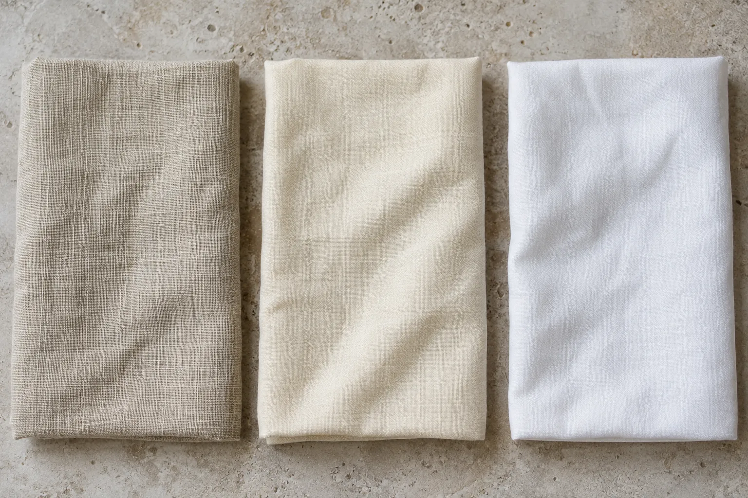
Ecru vs Cream vs White Comparison Table
The table describes typical appearances, not fixed specifications. A manufacturer can produce a very pale ecru or a relatively deep cream, and an item labeled white can have its own undertone. Use the table to narrow the direction you want, then examine the exact product. For instance, ecru may give a room a natural-fiber look, while cream may add yellow warmth. White can supply a clearer lightness contrast, especially against either of them. Fabric weave, paint finish, printing paper, and lighting can all change how strongly those differences appear.
| Attribute | Ecru | Cream | White |
|---|---|---|---|
| Base appearance | Muted off-white to light beige | Warm, yellow-tinted off-white | Light neutral appearance |
| Common undertone | Beige, tan, or muted gray-yellow | Yellow or buttery | Neutral, warm, or cool |
| Relative warmth | Often warm or near neutral | Usually warm | Varies by shade |
| Typical lightness | High, but often deeper than white | High, usually deeper than crisp white | Usually the lightest-looking of the three |
| Chroma | Low, with muted beige coloration | Low to modest, with yellow coloration | Very low when neutral |
| Textile association | Unbleached-looking linen and cotton | Warm fabric finishes | Bleached, natural, or optically brightened fabric |
| Interior uses | Upholstery, rugs, curtains | Walls, cabinetry, textiles | Trim, walls, ceilings, contrast |
| Fashion uses | Linen, knitwear, relaxed neutrals | Knitwear, dresses, warm layering | Shirts, dresses, high-contrast basics |
Ecru vs Other Popular Off-White Colors
Ecru vs Ivory
Ecru and ivory can both look soft beside a stark white. Ecru usually suggests a muted beige or tan influence and retains its association with unbleached-looking material. Ivory often suggests a lighter near-white with a subtler warm tint, although actual products can overlap considerably.
The distinction is especially uncertain in fashion and textiles. A brand may call a wedding garment ivory because it is softer than bright white, while another may call a similarly colored linen garment ecru. Their names may reflect styling or material associations as much as measurable color. To coordinate the two, compare samples in the same light and against the other items in the outfit or room. If the ivory looks yellow and the ecru looks gray-beige, their difference may be more apparent together than it was in separate product photographs.
Ecru vs Beige
Beige generally has more visible tan or brown coloration than an off-white ecru. In a typical comparison, ecru looks lighter and closer to white, while beige reads more readily as a color in its own right. There is considerable overlap at the boundary: a deeper ecru may look similar to a pale beige.
Use relative lightness and visible coloration to make the distinction. If the sample looks mostly white until you put it beside white paper, ecru may be the more useful description. If its tan quality remains obvious without a reference, beige may communicate the appearance better. That test is a guide, not a rule for how a seller must label a product. For an interior palette, the overlap can be useful. A light ecru wall and a somewhat deeper beige rug can create depth without a strong color change, provided their undertones work together.
Ecru vs Natural White
Both ecru and natural white can describe the appearance of unbleached or less intensely whitened textiles. The names, however, emphasize different impressions. Ecru often points to a visible beige or muted tan cast, while natural white may suggest a fabric that still reads predominantly white despite slight warmth or irregularity.
Textile suppliers do not use these labels uniformly. Material, processing, and lighting all influence the resulting shade. An unbleached linen sample could look ecru next to a bright white shirt yet appear like natural white beside a darker beige fabric. If you need curtains to match a sofa, ask for fabric samples rather than treating “natural” or “unbleached” as a color guarantee. Also remember that “natural” can describe the intended appearance of a finished textile; it does not, by itself, tell you every processing step used to make it.
Ecru vs Antique White
Antique white is a name commonly used for a white made to look softened or aged. Depending on the product, it may lean cream, beige, or gray. Ecru more strongly suggests the muted appearance associated with natural, unbleached fibers. Their appearances can still overlap, especially in paints and home furnishings.
The useful question is what kind of warmth each sample carries. An antique white paint may have a distinctly creamy, yellowed look, while an ecru fabric may appear tan and quieter. Another pair could be nearly indistinguishable. Do not assume that “antique” indicates a specific age, material, or formula; it is a descriptive color name. When combining antique white trim with ecru upholstery, view them beside the flooring and wall color. Those surrounding finishes can draw out a yellow cast in one sample and a gray cast in the other.
Cream vs Other Shades of White
Cream vs Ivory
Cream and ivory often occupy adjacent parts of the off-white range. Cream typically suggests more visible yellow warmth, whereas ivory often suggests a subtler, lighter warmth. If the cream is deep enough, it will also look darker beside a pale ivory. Yet there is no universal threshold that separates the names.
For a practical comparison, place the samples beside a neutral white and look at two things separately: how much darker each appears, and whether its undertone looks yellow, beige, or something else. This is more reliable than trying to judge warmth from photographs taken under different conditions. In clothing, fabric finish may dominate the first impression. A lustrous ivory fabric can catch bright highlights, while a matte cream fabric looks softer, even when their base colors are close. Evaluate both the color and the material before deciding whether they belong together.
Cream vs Eggshell
“Eggshell” can refer to a pale, muted off-white color, but in paint it also names a sheen. An eggshell-sheen paint can be made in many colors, including cream, white, or blue. Check whether a product listing describes its shade or the reflectiveness of its finish before comparing it with cream.
As a color name, eggshell often suggests a restrained, slightly warm near-white rather than a distinctly buttery cream. That impression is variable because eggshells themselves differ in color and brands define their shades independently. As a paint sheen, eggshell has a soft luster compared with a flat finish. The sheen can affect how a painted wall looks as light moves across it, even if the paint color stays the same. For a wall project, specify both properties separately: the exact shade you want and the sheen in which you want it made.
Cream vs Antique White
Cream points most directly to a warm yellow-tinted off-white. Antique white suggests an aged or softened white, but that aged impression can be achieved with yellow, beige, gray, or a combination. A particular antique white might therefore look very similar to cream, or it might look more muted and less yellow.
This is an important distinction when selecting paint next to fixed materials. A cream may pick up the yellow in a warm tile, while a gray-beige antique white may relate better to stone with quieter undertones. Neither label tells you enough to predict the outcome. Sample both colors on boards large enough to view against the tile, cabinetry, and trim. Observe them at different times of day. If one shade appears dingy beside a crisp white fixture, the issue may be its undertone or reduced lightness rather than a problem with the color in isolation.
Cream vs Warm White
Both cream and warm white may contain a yellow undertone. The difference is usually one of degree: warm white generally continues to read as white, while cream more readily registers as a warm color. A very pale cream and a strongly warm white can meet in the middle, so the names cannot establish a reliable boundary.
Consider a room with white trim and warm walls. If you want the walls to look subtly softer than the trim, a warm white may provide enough separation. If you want the warmth to be visible, a cream may work better. The effect depends on the specific trim color as much as the wall color. A cool white trim can make a faintly warm wall look creamier; a warm white trim can reduce the apparent difference. Compare the chosen samples together under the room’s actual light before ordering a large quantity.
How Lighting Changes Ecru, Cream, and White
Ecru, Cream, and White in Daylight
Daylight is useful for spotting subtle undertones, but it is not a single, unchanging lighting condition. The light entering a room varies with time of day, weather, window direction, and reflections from outside surfaces. A cream sample that looks gentle at one hour may appear more yellow later; ecru can shift between beige and grayish impressions.
Place the exact samples side by side where they will be used. For wall paint, view sufficiently large samples on more than one wall rather than trusting a small chip held near a window. For fabrics, move swatches between direct and shaded areas, since texture can affect how they reflect light. Include the neighboring whites in the comparison: trim, flooring, bedding, or clothing. The goal is to see how the colors behave as a group, because a single light neutral is often hard to classify without a reference.
Appearance Under Artificial Lighting
Lamps influence the colors you see because surfaces can reflect only the light that reaches them. Warm-looking illumination may emphasize the inviting appearance of cream and can make ecru seem richer. Cooler-looking illumination may reduce that impression or make a warm neutral stand out against cooler whites. The exact change depends on the lamp’s spectral output and the material, so a bulb label alone cannot predict every result.
Test samples under the lights you actually plan to use. A fabric chosen in a store may look different under home lighting; a wall paint approved in daylight may feel too yellow at night. If several light fixtures illuminate one room, inspect samples with the usual combination switched on. Photographing them can help document your preference, but a phone image may automatically adjust white balance and hide the very difference you are trying to judge. Your direct comparison under the intended lighting remains the more useful check.
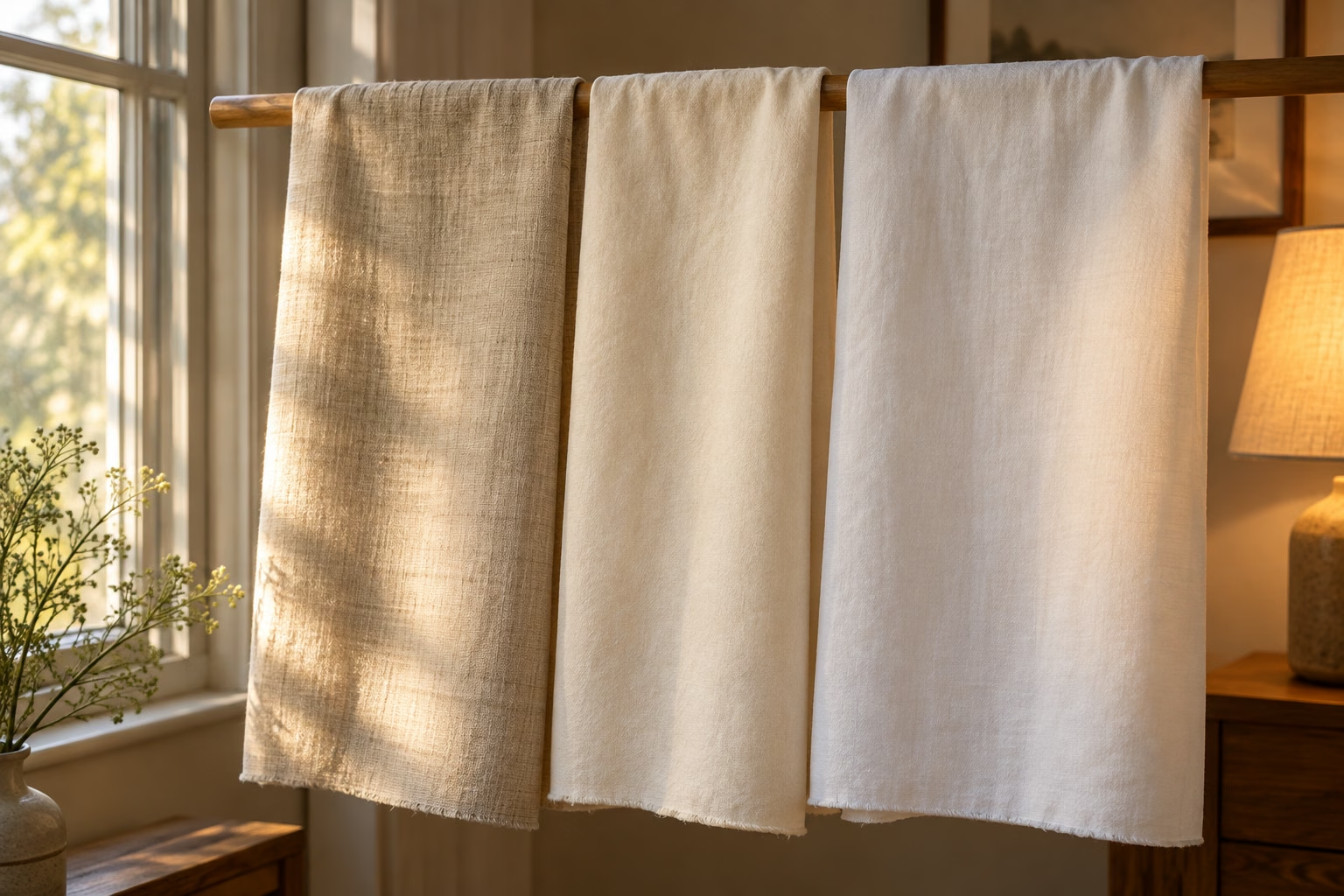
Why Color Rendering Matters
Color rendering concerns how a light source affects the appearance of objects compared with a reference. Light sources that look similarly “warm” can still have different spectral makeups and render a cream fabric or ecru wall differently. A lamp’s apparent color and its ability to show distinctions among object colors are related design concerns, but they are not the same measurement.
This matters most when differences are subtle. Under one lamp, two near-white fabrics may seem to match. Under another, one may reveal a yellow cast and the other a gray-beige cast. Optical brighteners in textiles add another complication because their effect depends on suitable illumination. If matching is important, compare the samples in the environments where they will be seen, such as daylight and the room’s evening lighting. Technical color-rendering information can help with lighting selection, but viewing the actual materials remains essential.
The Color Science Behind Ecru, Cream, and White
Hue, Chroma, Saturation, and Lightness
Hue describes a color’s direction, such as yellow or blue. Lightness describes how light or dark it appears relative to a reference. Chroma expresses the strength of its departure from a similarly light neutral. Saturation also concerns colorfulness, though its precise definition changes across color models. Keeping these ideas separate makes comparisons more informative than simply calling every sample “warm white.”
Cream typically has a yellow hue influence with low to modest chroma. Ecru often has a muted beige or yellow-brown influence, also at relatively low chroma. A neutral white has little identifiable hue and high lightness. Two samples can have nearly equal lightness but different undertones; two creams can have similar yellow undertones but different depths. When coordinating products, ask which property is causing the mismatch. That answer tells you whether to look for a lighter shade, a less yellow shade, or both.
Reflectance, Brightness, and Luminance
A surface’s reflectance describes how much light it returns, with its behavior varying across wavelengths. The light that reaches your eye also depends on the illumination, viewing angle, and surface finish. Luminance is a measurable property of that light in a specified direction. Brightness is your perception of how brilliant the viewed area appears.
These distinctions explain why color names alone cannot settle how “white” a material will look. A high-reflectance matte surface can look different from a glossy one because gloss produces directional highlights. A pale fabric viewed in shadow can appear less bright than a deeper fabric in direct light. And two materials that look similarly white under one lamp can diverge under another because they reflect wavelengths differently. For practical selection, compare samples in consistent lighting first, then check them in the range of lighting the finished space or outfit will encounter.
Measuring Colors With CIELAB
CIELAB is a color space defined by the International Commission on Illumination, or CIE, for describing color with three coordinates. L* represents lightness, from black at the low end toward white at the high end. a* describes a green-to-red direction, while b* describes a blue-to-yellow direction. A positive b* value, for example, indicates a tendency toward yellow relative to the measurement reference.
These coordinates can make an ecru-versus-cream comparison more precise. Two samples may have similar L* values but differ in b* or a*, helping explain why one appears more yellow or reddish. Measurements still require defined conditions, including the illuminant and reference white. A number copied from an unrelated website cannot reliably stand in for a measured fabric or painted surface. If accurate matching matters, ask the supplier for measurements taken under stated conditions or have the actual samples measured consistently.
What Is Delta E?
Delta E, written ΔE, expresses a calculated color difference between two measured samples. With CIELAB measurements, a color-difference formula uses the samples’ coordinates to describe how far apart they are. This can help assess whether two batches, finishes, or supplier samples match closely enough for a particular job.
A Delta E number needs context. Different formulas exist, and their results should not be treated as interchangeable without identifying the method. Measurement conditions, material texture, and the required quality standard also matter. A small numeric difference does not guarantee that two large adjacent surfaces will look identical in every light. Conversely, two products with different marketing names can measure quite close. Use ΔE as a tool for a defined comparison, alongside a visual check of the real materials. For ordinary home or wardrobe decisions, side-by-side samples may be sufficient; production matching calls for a more controlled process.
Digital Representations of Ecru, Cream, and White
RGB Values
RGB describes colors made from red, green, and blue light in an additive digital system. In common 8-bit notation, each channel ranges from 0 to 255. RGB(255, 255, 255) represents digital white; a warm off-white can be represented by reducing the blue channel relative to red and green. That is an illustration of the mechanism, not a universal recipe for cream.
No single RGB value defines every ecru or cream. A designer chooses numbers for a particular shade, and their appearance depends on the color space, display, and viewing conditions. A digital swatch also cannot fully reproduce the texture or fluorescent whitening of a physical textile. When building a website or brand system, select and record the exact color values used across components. When matching a screen color to paint or fabric, inspect a physical sample instead of assuming that a visually similar screen swatch provides an exact material specification.
HEX Colors
A HEX color is a common way of writing RGB channel values for web design. #FFFFFF denotes white in standard six-digit notation, with FF indicating the maximum value for each of the red, green, and blue channels. Other combinations can represent countless near-whites. A pale yellowish shade, for example, will use a different combination from a muted beige shade.
The crucial point is that generic names such as “ecru” and “cream” do not have universal HEX codes. Different websites can publish different values under the same name, each describing its own chosen swatch. Some color names are specifically defined as CSS keywords, but that does not make every retail or design use of the name an exact match. If you want consistency across a site, document the chosen HEX value in its design system and use that value throughout. Check the result on real devices, while recognizing that displays may show it differently.
CMYK for Printing
CMYK describes a printing process built around cyan, magenta, yellow, and black colorants. Translating an RGB cream or ecru into print is not as simple as substituting four percentages for a HEX code. The printing process, color profile, paper, inks, and viewing light all affect the result.
Near-white colors require particular care because the paper itself supplies much of the visible surface. On white paper, a very pale cream may be produced with a light tint; on naturally warm paper, the unprinted sheet may already resemble the intended shade. An off-white design printed on different stocks can therefore look different even when the same file is used. For important packaging or stationery, choose the paper before judging the color and request a production-relevant proof. If the aim is to match a fabric or paint, provide the printer with a physical reference and agree on the acceptable result under stated viewing conditions.
Pantone and RAL Color Matching
Pantone color systems give designers and suppliers defined references for communicating selected colors in relevant production contexts. RAL color systems serve a similar reference role in areas such as coatings and architectural or industrial finishes. A specified reference is more informative than a loose request for “cream” or “ecru,” but the reference must suit the material and process being used.
A generic color name does not automatically correspond to one Pantone or RAL color. Even when a supplier suggests the closest reference, a match on a printed guide may differ from a textile, wall paint, or powder-coated surface because material and finish affect appearance. Identify the exact standard, reference number, and physical sample when consistency matters. Then approve a production sample in the relevant finish. Standardized references improve communication; they do not remove the need to check the finished material.
Ecru, Cream, and White in Interior Design
Building a Neutral Palette
A neutral palette uses restrained colors as the main setting for a room. White, cream, ecru, beige, and muted gray can all take part, but their undertones influence whether the combination feels cohesive. A cream wall and ecru sofa often work well when their warmth is compatible. A cool gray rug may create deliberate contrast or make the warmer pieces look more yellow.
Start with the finishes you cannot easily change, such as flooring, countertops, or tile. Hold paint and fabric samples against them before choosing a wall color from an isolated swatch. Next, decide which neutral should lead: crisp white for a brighter contrast, cream for more yellow warmth, or ecru for a muted natural look. Add other neutrals in visibly lighter or darker steps. The goal is a relationship among actual materials, not a collection of product names that happen to sound compatible.

Creating Tonal Contrast
Tonal contrast comes from differences in lightness. White trim against a cream wall, or white bedding against an ecru headboard, can create definition while keeping the palette quiet. If the colors are too close in lightness but have different undertones, they may appear to be an attempted match. A clearer lightness difference can make the combination look more intentional.
Test contrast at the scale where people will see it. A narrow painted swatch may seem distinct from white trim, yet a full wall can change the room’s overall light balance. Likewise, two fabrics that differ clearly when folded together may blend when separated across a large room. Texture can reinforce the distinction: smooth white ceramic beside woven ecru linen will read differently even if the colors are similar. Use both lightness and material to establish which surface should stand forward and which should provide a background.
Creating a Monochromatic Palette
A monochromatic palette uses closely related colors in varying depths and strengths. With near-whites, that might mean a warm white ceiling, pale cream walls, ecru curtains, and a deeper beige cushion. The palette stays within a restrained color direction while creating enough variation for each element to remain visible.
The challenge is that small undertone differences can become noticeable when everything else is subdued. Compare the shades together before committing, especially if a large surface is involved. You can also vary texture to add depth without introducing a strong new color: matte walls, woven linen, soft wool, and smooth ceramic each interact with light differently. A monochromatic room need not make every object match. It works best when the relationship among the shades looks deliberate and remains appealing under both daylight and evening lighting.
Color Coordination With Ecru, Cream, and White
Color coordination means choosing shades that create the relationship you want when seen together. For ecru, cream, and white, begin with undertones rather than labels. A yellow cream, tan ecru, and warm white may feel connected. A cooler white can also work, but it will make a more visible break from the warm materials.
That break may be exactly what you want. White architectural trim can outline cream walls, while an ecru rug can soften the transition to wood flooring. Problems arise when you expect two near-whites to match and their undertones differ just enough to look accidental. Put samples directly beside each other and beside the fixed materials. Check the group in daylight and under the room’s lamps. If one sample looks unexpectedly yellow, gray, or dull, choose a shade with a more suitable undertone or increase the contrast so the difference reads as a design choice.
Ecru vs Cream vs White in Fashion and Textiles
Choosing Between Ecru, Cream, and White Clothing
White clothing often gives the clearest visual contrast, especially beside darker garments. Cream adds visible warmth, while ecru introduces a quieter beige or natural-fiber appearance. These are descriptions of the garments’ visual effects, not rules about who can wear a shade or which season permits it.
The best choice depends on the other clothes you intend to combine with it. Compare a shirt or dress directly with the jacket, trousers, shoes, or accessories in the outfit. A cream blouse may emphasize yellow in a nearby ivory garment; an ecru shirt may coordinate more easily with tan linen. Fabric also matters. A white satin piece catches light differently from a white cotton one, while textured ecru may appear deeper in its folds. Product names and online images are starting points. When an exact match matters, examine the garments together in person or request swatches.
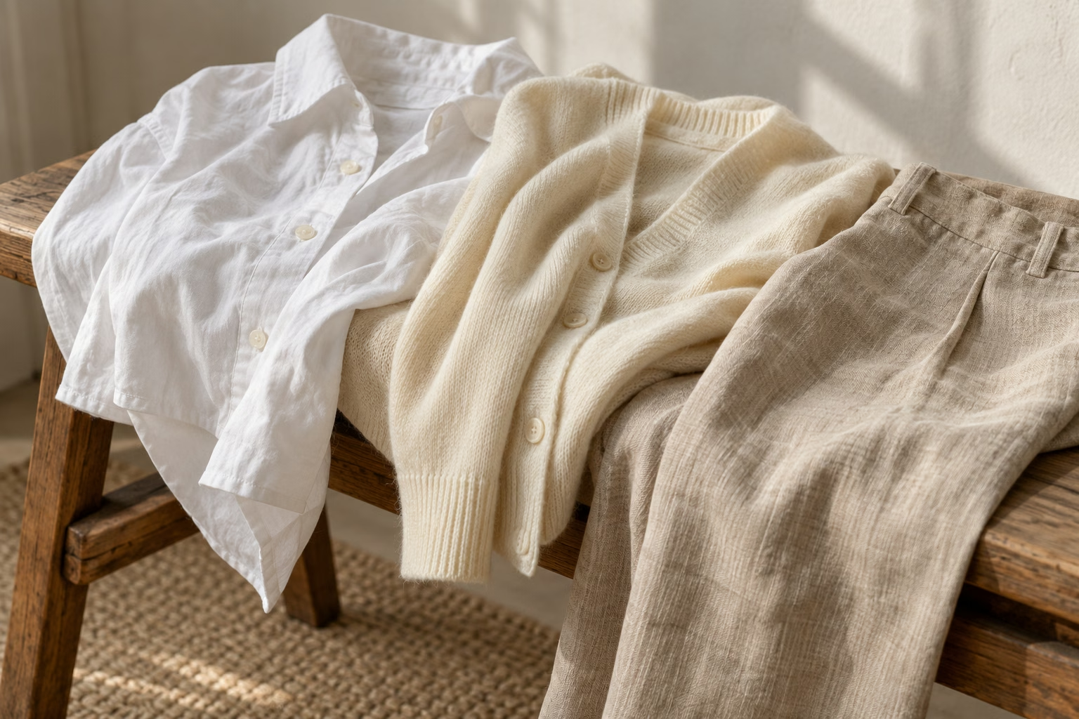
Ecru and Unbleached Linen
Ecru has a strong association with unbleached linen because the term historically describes the color of raw-looking, unbleached material. A linen garment or curtain in this range can have a muted quality that bright white linen does not. The fibers, weave, and finishing influence the final appearance, so “unbleached linen” should not be expected to produce one uniform shade.
Texture contributes to the perception of color. Linen may show small variations in yarn and reflect light differently across creases and woven areas. A photograph can flatten those details or make the fabric appear warmer than it does in person. If you are combining several linen pieces, order samples from the actual products and compare them in the same light. Two items called ecru might work beautifully as intentionally varied neutrals, but they may disappoint if the goal is a seamless match between curtains and upholstery.
White and Optical Brighteners in Clothing
Some white textiles are treated with optical brighteners to make them appear especially white or brilliant under suitable lighting. These agents can absorb ultraviolet light and emit visible light, helping counter a yellow cast. Other white garments may be bleached without that particular brightening effect, while natural-white or ecru garments retain a warmer-looking appearance.
That helps explain why one white T-shirt can make another look cream-colored when they are laid together. It does not prove which treatment either garment received: fabric construction, washing, dyes, and lighting also influence the result. Be cautious when matching separate white garments for a uniform, suit, or layered outfit. Compare the actual pieces under daylight and the lighting where they will be worn. A very bright white next to an ecru linen jacket can provide attractive contrast; two nearly matching whites with different casts may need a clearer difference to look intentional.
Mixing White, Cream, and Ecru in One Outfit
White, cream, and ecru can make a layered outfit when each shade has a role. A white shirt can provide the crispest light area, a cream knit can add warmth, and ecru trousers or a jacket can introduce muted depth. Their different textures can make the layers distinct even when the color differences are subtle.
Lay the garments together before deciding. If the white is cool and bright while the cream is distinctly yellow, check whether that contrast suits the rest of the outfit. If two pieces are nearly identical in lightness but differ in undertone, they may look mismatched; adding an obviously deeper ecru or changing one piece may clarify the palette. Shoes and accessories can connect the shades through related tan, brown, or warm metal tones, but there is no required formula. Aim for visible relationships among the particular garments rather than trying to match three flexible color names.
How to Tell Ecru, Cream, and White Apart
Compare the Colors Side by Side
Place the samples next to one another on a neutral surface, with a consistent white reference nearby. Compare them in two passes. First, ask which looks lighter or darker. Second, look for the color cast: beige or tan suggests ecru, while clearer yellow suggests cream. A sample that still reads white may have only a slight warm or cool undertone.
Use a reference to reveal differences, but remember that the reference itself may not be perfectly neutral. A bright white sheet of printer paper, for instance, may contain optical brighteners and look cooler or more brilliant than another white. The comparison still helps show relationships among the samples; it does not scientifically classify them. For a purchase, include the other item you need to match, such as a cabinet door, sofa fabric, or shirt. Matching the intended partner is more useful than settling the abstract question of what to call a swatch.
Check the Colors Under Different Lighting
After comparing samples together, repeat the check in daylight and under the artificial lighting where the colors will be used. Daylight changes through the day, while lamps vary in apparent warmth and color rendering. These changes can reveal a yellow cast in cream, a gray cast in ecru, or a cool cast in white that was difficult to see elsewhere.
Keep the samples together as you move them. If you compare one fabric in a shop and another at home, the different surroundings can make the remembered colors unreliable. For interiors, view samples vertically when possible, because a wall or curtain receives light differently from a swatch laid flat on a table. For clothing, check the pieces both hanging and next to each other. If the shades only match under one lighting condition, decide whether that condition reflects how they will normally be seen.
Use Measured Color Values When Accuracy Matters
When a close match affects production, obtain measurements of the actual samples under consistent conditions. CIELAB coordinates can describe their lightness and color tendencies: L* helps compare depth, while a* and b* help distinguish undertones. A specified Delta E method can then quantify the difference between samples.
Measurements are especially useful for repeat fabric orders, manufactured finishes, packaging, or a large project involving several suppliers. Record the measurement conditions and acceptable tolerance with the supplier; otherwise, numbers from different instruments or conditions may be difficult to compare. Where a Pantone or RAL reference fits the production process, provide the exact reference rather than the name “cream” or “ecru.” Finally, approve a physical sample in the intended material and finish. A useful specification combines numbers or standards with an agreed visual result.
Frequently Asked Questions
Is ecru closer to white or beige?
It depends on the shade. Pale ecru can look like a beige-tinted off-white, while deeper ecru looks more like light beige.
Is ecru darker than cream?
Often, but not always. Ecru commonly has more visible tan depth, while cream may be a paler yellow off-white. Compare the specific samples to establish which is darker.
Is cream darker than white?
Cream usually looks deeper than a crisp white because its yellow coloration is visible. A very pale cream may still look white when viewed alone.
Is ivory the same as cream?
The names overlap, but ivory often suggests a subtler near-white warmth, while cream often suggests more noticeable yellow. Brands use both names differently.
Is ecru the natural color of linen?
Ecru is historically associated with unbleached linen. Actual linen varies with its fibers and processing, so it does not have one universal natural color.
What undertone does ecru have?
Ecru commonly has a muted beige, tan, or gray-yellow undertone. Some versions lean warmer, and others appear relatively neutral.
What undertone does cream have?
Cream typically has a yellow undertone. Its warmth can be barely noticeable or distinctly buttery, depending on the shade.
Can white have an undertone?
Yes. A white paint or textile can appear subtly warm, cool, grayish, or nearly neutral, particularly when compared directly with another white.
Do ecru, cream, and white have universal HEX codes?
No universal HEX code defines ecru or cream. Digital white has a standard RGB representation, #FFFFFF, but physical products labeled white can vary considerably.
Which colors work together in a neutral palette?
Whites, creams, ecrus, beiges, and muted grays can work together. Compare their undertones, give the shades enough lightness contrast, and check the combination under the intended lighting.
Ecru vs Cream vs White: Understanding the Distinction
Ecru recalls unbleached natural fibers and commonly carries a muted beige undertone. Cream is generally a yellow-tinted off-white that appears warmer than many whites. White usually looks brighter than either, but a physical white can itself be warm, cool, or neutral.
Those descriptions help you choose a direction; they cannot guarantee a match. Lighting changes how the shades appear, materials add texture and finish, and surrounding colors make subtle undertones easier to notice. For an everyday decision, compare the actual samples side by side where you will use them. For a production decision, specify the chosen color with an appropriate standard or measured values and approve a physical sample.
